Summarize this documentation using AI
Key Takeaways
- Most published retention benchmarks fail at least one of five tests: provenance, vintage, sample, formula and denominator. Check all five before quoting a number.
- Definition changes the number more than performance does. Brevo reports ecommerce email opens at 15.50% and 30.02% from one dataset, the only difference being whether Apple bot opens are counted.
- Most "2026" retention benchmarks are 2023 data. The primary sources behind the ecommerce numbers circulating online are Decile's 2023 guide and Metrilo's undated dataset.
- Platform benchmark reports draw from that platform's own customers, and one large set is openly sampled from its "most successful" accounts. Self-selection runs one way.
- Your own trailing cohorts beat any industry average. Cohort-over-cohort is the only comparison that holds product, price and audience roughly constant.
We keep a library of B2C retention benchmarks: retention and repeat purchase rates by vertical, churn by subscription category, app retention curves, email engagement by industry. This post is the instruction manual for it, and it is deliberately not another table of numbers.
The reason is that we kept watching good operators reach wrong conclusions from correct data. Someone reads that ecommerce retention averages 30%, sees 22% in their own dashboard, and starts a remediation project. Six weeks later it turns out the 30% was measured over twelve months on a 2023 sample and their 22% was measured over ninety days last quarter. Nothing was broken. The comparison was.
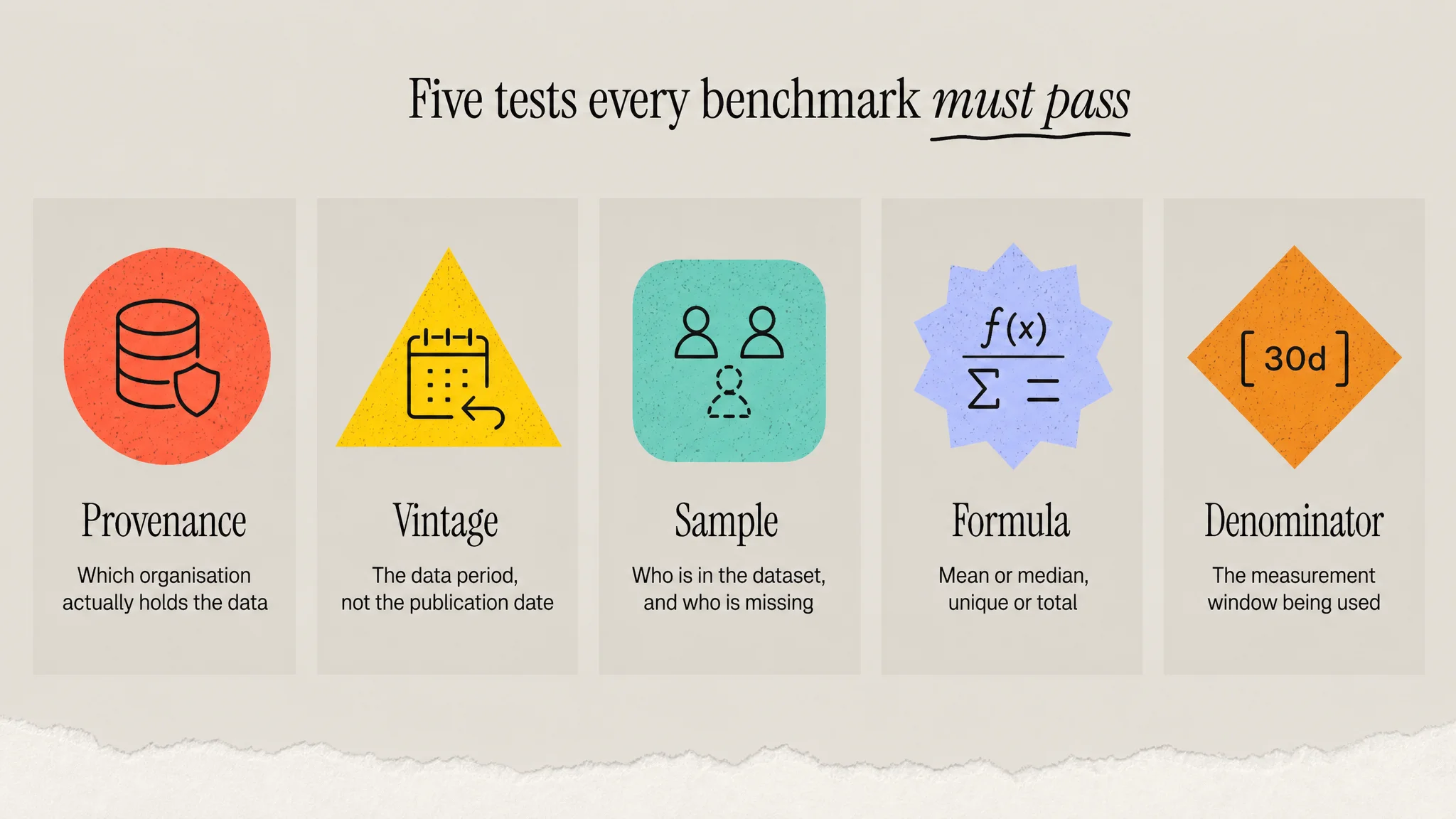
So before you use any benchmark, ours included, run it through five tests.
Test 1: Provenance. Who actually measured this?
Follow the citation until it ends at an organisation that holds data. Often it does not end anywhere.
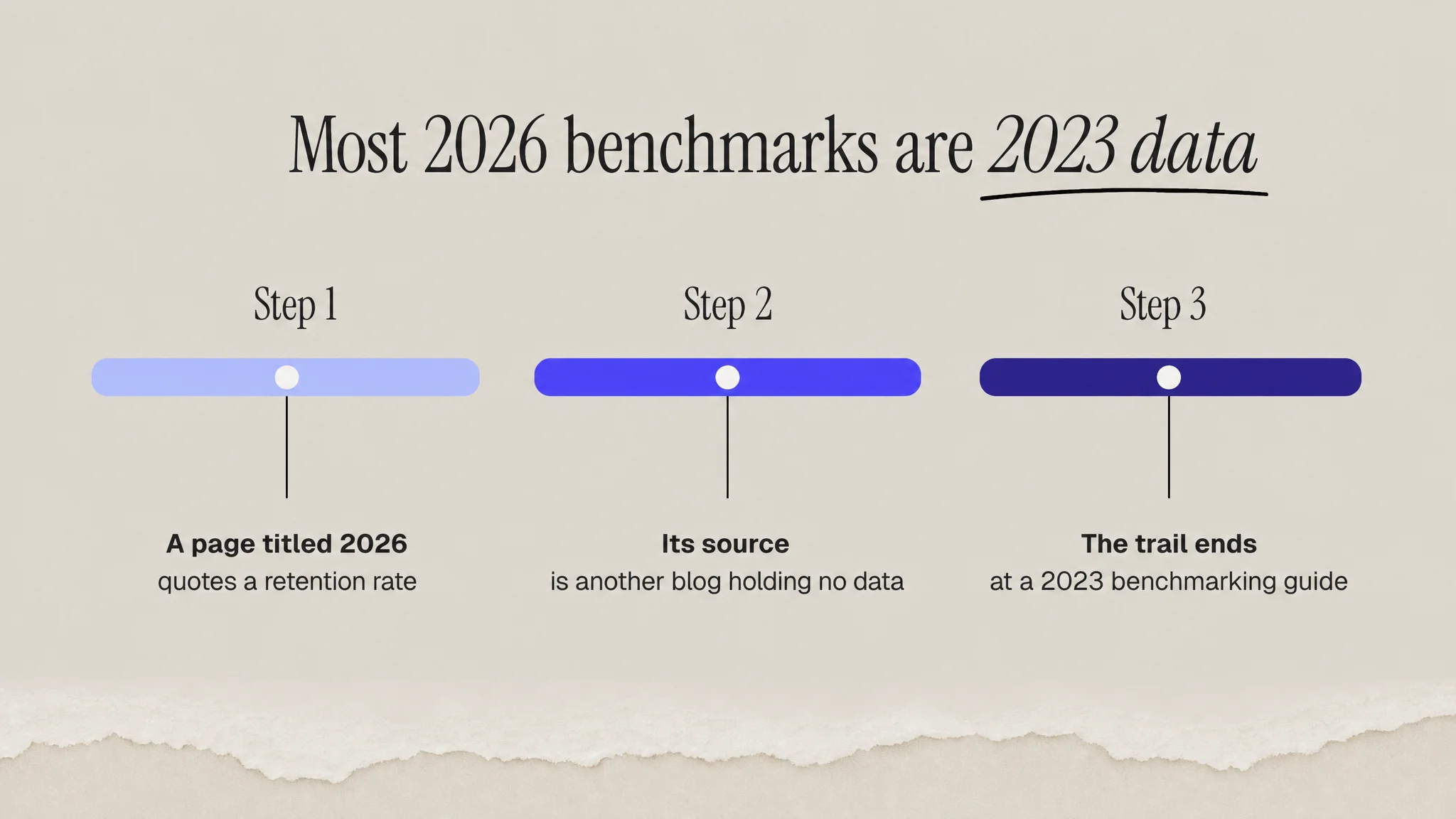
When we went looking for a 2026-dated ecommerce retention benchmark broken out by category, we found dozens of pages offering exactly that. Almost none of them had measured anything. They cited other blogs, which cited other blogs, which eventually cited one of two primary datasets. One prominent source we checked turned out to aggregate its retention tables from three other content sites, none of which held original data either.
The practical rule: if you cannot name the company that ran the query and the population they ran it against, do not put the number in a board deck. A benchmark without provenance is a rumour with a decimal point.
What good provenance looks like
The strongest retention numbers available are the ones companies are legally obliged to get right. Chewy disclosing that Autoship accounted for 83.3% of net sales in fiscal 2025 is an audited figure in a public filing. HelloFresh disclosing that by Q4 2025 "a majority of orders were placed by customers who had previously ordered 50+ boxes" is the same class of evidence. Single companies rather than industry averages, but real.
Test 2: Vintage. When was this measured?
Publication date is not data date, and the gap is routinely three years.
The widely quoted "30% average ecommerce retention rate" traces to Decile's 2023 Benchmarking Guide. It is a good figure, from a real dataset, measured over a clean twelve month window. It is also from 2023, and it is being served to you on pages titled 2026. Metrilo's 28.2% overall DTC retention rate across 65 businesses does not state a data period at all.
Neither of those is a reason to discard the numbers. They are the best available and we cite them ourselves. It is a reason to say "2023" out loud when you use them, especially given how much has changed in acquisition economics since. Yotpo's 2026 analysis reports that customer acquisition costs "have risen structurally by 25-40% depending on the channel". A retention benchmark set before that shift is describing a different economy.
Test 3: Sample. Who is in this dataset, and who is missing?
Every platform benchmark report is a census of that platform's customers, not of the market. That is not dishonest, it is just narrower than the headline implies. Brands on a mid-market ESP look different from brands on an enterprise one, and neither resembles the long tail on no platform at all.
Some reports are refreshingly explicit about it. Constant Contact's benchmark set is drawn from "37,000 of Constant Contact's most successful customers". Read that phrase carefully. It is a benchmark of winners, which makes it a target rather than an average, and comparing yourself to it will make a healthy program look mediocre.
Sample size also gets used as a proxy for quality when it is not one. A dataset of 20 billion emails from 27,000 brands and a dataset of 65 DTC businesses are useful for different things. The 65-brand set gave us the only verified time-between-orders figures by category we could find, ranging from 41 days for meal delivery to 148 days for coffee. Small and specific beat large and blended, when the question is specific.
Test 4: Formula. What exactly is being counted?
This is where most benchmark comparisons quietly fall apart, because two sources use the same word for different arithmetic.
- Mean or median? MailerLite reports medians across 3.6 million campaigns. Most others report means. Medians resist outlier skew and generally read higher on engagement metrics, so a median-versus-mean comparison is not a comparison.
- Unique or total? GetResponse counts every action, noting that "every subscriber action counts, whether they reopened your emails or clicked on all your links." That inflates rates relative to unique-based sources by construction.
- Retention or repurchase? In Decile's own table, fashion shows a 19% retention rate and a 30% repurchase rate. Same brands, same year, two different questions. Quoting one as the other overstates or understates by ten points.
If a source does not state its formula, you are guessing. In our own review of the major email benchmark sets, exactly one published the arithmetic explicitly.
Test 5: Denominator and definition drift
The most dramatic example of definition beating performance is not in retention at all, it is in email, and it is worth studying because the same failure mode applies everywhere.
Brevo publishes two open rate figures for every vertical from a single dataset of over 175,000 customers: one excluding Apple Mail Privacy Protection bot opens and one including them. For ecommerce, those figures are 15.50% and 30.02%. Same brands, same year, same vendor. The number doubles based purely on a definitional choice about what counts as an open.
Apple's own documentation confirms the mechanism: content is fetched "in the background by default, regardless of whether you engage with the email." Litmus, measuring over a billion opens in July 2026, put Apple at 62.26% of tracked opens with MPP affecting "roughly 55-60% of all email opens."
The retention equivalent is the measurement window. "Retention rate" over 90 days and over 12 months are different metrics wearing the same label, and in a category that reorders every 107 days, the 90 day version counts your normal customers as lost.
The comparison that actually works: your own cohorts
Having run all five tests, here is the uncomfortable conclusion: even a benchmark that passes them tells you relatively little about your business, because it cannot hold your product, price point, audience and acquisition mix constant. Industry averages orient you. They do not diagnose you.
The diagnostic comparison is cohort over cohort. Group customers by the month they first purchased, then track each group's repeat behaviour along the same number of days since acquisition. Now a difference between the January group and the June group means something, because almost everything else is held roughly still.
This is also the only view that catches the failure mode a blended number is built to hide. A brand can grow revenue while every successive cohort retains worse than the last, because new-customer volume masks the decay. Blended retention looks flat. The cohort chart shows the floor giving way.
If you are setting this up, the sequence is: cohort analysis for the method, the retention curve for what shape to look for, and cohort LTV versus blended LTV for why the blended version flatters you. Then pick your small set of tracked metrics deliberately, using key retention metrics and KPIs as the shortlist.
Three rules for benchmarking yourself
- Set the window from your own purchase cadence. Measure your median time between orders first, then choose a retention window at least as long. Never inherit a 30 or 90 day default.
- Compare like sub-categories. Beauty spans 13% retention in haircare to 36% in specialised products. Category-level averages hide a spread wider than the gap you are trying to close.
- Separate model from execution. Before blaming your lifecycle program, check whether the benchmark brands run subscription and you do not. That difference outweighs execution quality.
What is in the benchmarks library
The library is organised by vertical, with the source and data period attached to every figure so you can run the five tests yourself:
- Retention benchmarks by vertical, covering DTC, subscription boxes, health and wellness, telehealth, consumer apps, fintech, marketplaces and food and beverage.
- Customer retention rates by industry for the wider cross-industry view.
- Subscription churn, including how to calculate it consistently, and subscription retention for the model-level picture.
- Churn prevention and the B2C retention stack for turning a diagnosis into a build.
The bottom line
A benchmark is a measuring instrument, and instruments need calibration labels. Provenance, vintage, sample, formula, denominator: five questions, about a minute each, and they will stop you from launching a remediation project against a phantom gap. Then set the real target where it belongs, on your own cohort curve, and let the industry numbers do the modest job they are actually good for.
Sources
- Decile, 2023 Benchmarking Guide (2023 data)
- Metrilo, Customer Retention in DTC Brands report (65 DTC businesses, period not stated)
- Metrilo, Beauty brands ecommerce benchmarks
- Chewy, Inc. fiscal Q4 and full year 2025 results
- HelloFresh SE, Q4 and FY 2025 press release
- Brevo, Email marketing benchmarks (175,000+ customers, 2025)
- Apple, Mail Privacy Protection privacy documentation
- Litmus, Email Client Market Share (1 billion+ opens, July 2026)
- MailerLite, Industry benchmarks (3.6 million campaigns, medians)
- Constant Contact, What is a good open rate for email (37,000 customers, Q1 2026)
- GetResponse, Email marketing benchmarks (4.4 billion messages, 2023)
- Yotpo, DTC brand comparison (2026)
Frequently Asked Questions
How do you know if a retention benchmark is trustworthy?
Run five tests: provenance (which organisation actually holds the data), vintage (the data period, not the publication date), sample (who is in the dataset and who is missing), formula (mean or median, unique or total, retention or repurchase) and denominator (the measurement window or definition). A benchmark that fails any one of these can be wrong by a factor of two.
Why do published retention and engagement benchmarks disagree with each other?
Because definitions differ more than performance does. Brevo publishes ecommerce email open rates of 15.50% and 30.02% from a single dataset, the only difference being whether Apple Mail Privacy Protection bot opens are counted. The retention equivalent is the measurement window: a 90 day and a 12 month retention rate carry the same label and mean different things.
Are platform benchmark reports reliable?
They are directional, not authoritative. Every platform report is a census of that platform's own customers rather than of the market, so the population is self-selected. One large email benchmark set is openly drawn from its provider's most successful customers, which makes it a target rather than an average. Use them to orient, and state the sample whenever you quote them.
What is the difference between cohort and blended retention?
Blended retention mixes all customers regardless of when they joined, so growing new-customer volume can mask decay. Cohort retention groups customers by their first purchase month and tracks each group at the same age. A brand can grow revenue while every successive cohort retains worse: blended looks flat, while the cohort curve shows the floor giving way.
Should you benchmark against your industry or against yourself?
Yourself, first. Cohort-over-cohort comparison holds product, price, audience and acquisition mix roughly constant, so a difference between your January and June cohorts actually means something. Industry averages cannot hold any of that still, so they orient you rather than diagnose you. Use them for context once your internal trend is honest.