
Summarize this documentation using AI
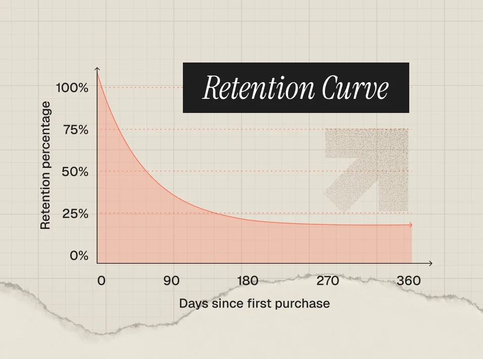
A retention curve is a line chart that shows what percentage of a user cohort is still active over time after their start date. The x-axis is time since signup or first purchase (day, week, or month), the y-axis is the percentage of the original cohort still active, and the line almost always slopes down before (hopefully) leveling off. It is the single most honest picture of whether your product and lifecycle program actually keep customers.
Revenue can grow while retention quietly collapses, because acquisition spend hides the leak. The retention curve strips that away. One glance tells you whether you are building a compounding business or refilling a leaky bucket every month, which is why investors, product teams, and retention marketing teams all start here.
This guide covers how to read a retention curve, the three shapes every operator should recognize, how to build one from cohorts, how it differs from a churn curve, what "good" looks like by product type, and the lifecycle levers that actually flatten the curve.
What is a retention curve?
A retention curve plots the share of a cohort (users who started in the same period) that remains active at each time interval after that start. "Active" is whatever action defines value for your business: opening the app, placing a repeat order, renewing a subscription, or logging a workout.
Three anchor points define any retention curve:
- Period 0: 100% of the cohort, by definition. Everyone was active when they started.
- The initial drop: The steep decline in the first days or weeks, driven by users who never reached your product's core value. In Quettra data analyzed by Andrew Chen, the average mobile app loses 77% of its daily active users within 3 days of install and around 90% within 30 days.
- The asymptote: Where the curve flattens. This plateau represents your true retained base, the users who found habitual value. If the curve never flattens, you do not have one yet.
The curve is a diagnostic, not a vanity metric. The early slope tells you about onboarding and activation. The plateau height tells you about product-market fit and habit formation. The long tail tells you about loyalty, customer LTV, and how much you can afford to spend on acquisition.
How do you read a retention curve?
Read a retention curve in three passes:
- Does it flatten? Trace the line from left to right. If it bends toward horizontal at any point, some segment of users has formed a habit and you have a retained base to build on. If it keeps sliding toward zero, every cohort eventually dies and growth depends entirely on new acquisition.
- Where does it flatten, and how high? A curve that flattens at 35% is a fundamentally different business than one that flattens at 8%, even if both "flatten." The plateau height caps your LTV and your sustainable CAC.
- How fast is the early drop? Compare period 1 retention across cohorts. A steepening early drop usually means an acquisition-quality or onboarding problem. A stable early drop with a decaying tail points to engagement and lifecycle gaps.
Then layer cohorts on top of each other. Plotting each monthly cohort as its own line shows whether newer cohorts retain better than older ones. If your March cohort sits above your January cohort at every point, your product and lifecycle changes are working. Amplitude's retention analysis documentation is a good walkthrough of reading these charts and tracking how changes affect specific milestones like day 1 or day 14 retention.
What are the three retention curve shapes?
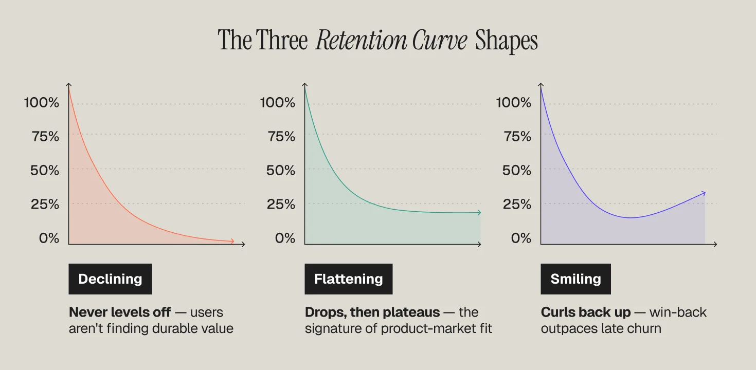
Nearly every retention curve resolves into one of three shapes, and each demands a different response.
1. The declining curve
The line drops and keeps dropping, never leveling off. Every cohort trends toward zero, just at different speeds. This is the most common shape for early products and the most dangerous, because paid acquisition can mask it for quarters at a time. A declining curve is not a marketing problem you can email your way out of; it signals that users are not finding durable value. Fix activation and core product value first, then layer lifecycle on top.
2. The flattening curve
The line drops early, then bends into a stable plateau. This is the signature of product-market fit for a segment of your users. Once you have a plateau, the retention game becomes two jobs: raise the plateau (get more of each cohort to the habit moment) and shift the flattening point earlier (shorten time to value). Most healthy subscription and DTC businesses live here, and most of the gains come from onboarding and activation improvements plus consistent lifecycle triggers.
3. The smiling curve
The line drops, flattens, then curls back up as churned or dormant users return. This is rare and powerful, because it means resurrection is outpacing late churn. Marketplaces with strong seasonal pull, products with expanding use cases, and brands with excellent win-back programs can produce smiles. In its AI retention benchmark analysis, a16z highlights ChatGPT as a rare "smiling" retention story, with churned and low-usage customers returning as capabilities improve. You can engineer partial smiles with win-back campaigns, but a sustained smile usually reflects genuine product gravity.
How do you build a retention curve from cohorts?
A retention curve is cohort analysis rendered as a line. Here is the construction:
- Define the cohort. Group users by start period, for example everyone who made a first purchase in January. Never mix start dates; blending cohorts hides trends. Our guide to cohort analysis covers how to segment these properly.
- Define "active." Pick the value action and measurement window: unbounded retention (returned on or after day N) is forgiving; N-day retention (returned on exactly day N) is strict. Tools differ, so document your choice. Mixpanel's retention report docs explain the "on," "on or after," and custom-bracket variants.
- Count survivors per interval. For each period after the start, calculate the percentage of the original cohort that performed the value action.
- Plot it. Time on the x-axis, percentage retained on the y-axis, one line per cohort. The familiar cohort triangle heatmap and the retention curve are the same data in two views.
- Match the interval to your natural frequency. Daily curves for social and gaming, weekly for fitness and food delivery, monthly for subscriptions and DTC replenishment. Judging a monthly-use product on day 7 retention guarantees a false alarm.
Retention curve vs churn curve: what is the difference?
They are mirror images. A retention curve shows the percentage of a cohort still active; a churn curve shows the cumulative percentage that has left. If month 6 retention is 40%, cumulative churn at month 6 is 60%.
The practical differences matter more than the math:
- Retention curves are cohort-based and shape-oriented. They answer "do users stick, and when do we lose them?" That makes them the right lens for product and activation work.
- Churn analysis is usually rate-based and period-oriented. Monthly churn rate (customers lost this month divided by customers at the start of the month) answers "how fast is the base leaking right now?" That makes it the right lens for finance and forecasting. Our subscription churn guide covers the calculation variants.
- Churn splits into voluntary and involuntary. Recurly's churn benchmark research puts overall subscription churn at 3.60%, with voluntary churn (2.34%) nearly double involuntary churn (1.25%). Failed payments alone can eat a visible chunk of your curve, and they are the cheapest churn to fix.
Use both: the retention curve to find where the leak is, churn rates to size it in revenue terms.
What does a good retention curve look like by product type?
There is no universal benchmark, because usage frequency and switching costs vary wildly by category. The most cited reference is the benchmark study Casey Winters published with Lenny Rachitsky, built on surveys of growth practitioners. For consumer transactional products like Airbnb or Lyft, roughly 30% six-month retention is good and roughly 50% is great. The study's broader pattern holds across categories: B2B and SaaS products retain better than consumer apps, and high-frequency habitual products retain better than episodic ones, so a "great" curve for a meditation app would be a crisis for an enterprise tool.
Directional rules of thumb:
- Consumer mobile apps: Steep early drops are normal (recall the 77%-in-3-days figure above). Elite apps differentiate on the plateau, not the day 1 number.
- Subscription and DTC: Watch the month 1 to month 3 window; most subscription businesses lose the largest share of a cohort before the third renewal. Retention rates vary meaningfully by industry, so benchmark against your vertical, not the internet at large.
- AI products: a16z suggests rebasing curves to month 3 to filter out "AI tourists" before judging the plateau.
Whatever your category, the bar that matters most is your own history: newer cohorts should sit above older ones. For current cross-industry numbers, see our roundup of customer retention statistics and benchmarks.
How do you flatten a retention curve with lifecycle marketing?
Flattening the curve means intervening at the exact points where cohorts leak. Map your lifecycle program to the curve's anatomy:
- Attack the initial drop with activation. The steep first segment is an onboarding problem. Identify the behavior that separates retained users from churned ones, then build your welcome flow to drive that single action fast. Email and push sequences that push users to the "aha" moment do more for the curve than any later-stage campaign.
- Raise the plateau with habit loops. Behavioral triggers tied to real usage (replenishment reminders, streaks, milestone celebrations, personalized recommendations) convert occasional users into habitual ones. This is the core of how retention marketing works in practice.
- Catch the mid-curve leak with churn prediction. Declining session frequency, skipped orders, and unopened emails precede cancellation by weeks. Score those signals and trigger save flows before the cancel click. Our guides to churn prevention and identifying users who are about to churn break down the playbook.
- Engineer the smile with win-back. Dormant users already understood your value once. Segmented win-back campaigns, reactivation offers, and "what's new" product updates are how you bend the tail of the curve upward instead of letting it drift.
- Fix involuntary churn. Dunning flows, card updaters, and retry logic recover failed payments that would otherwise show up as curve decay you did nothing to deserve.
Then close the loop: ship the change, watch the next cohort's line, and compare it to the last one. The retention curve is the scoreboard for every lifecycle experiment you run.
How Propel flattens retention curves
Propel is a lifecycle and retention marketing agency for B2C, DTC, subscription, and health brands, and a Platinum Customer.io partner. We start every engagement by rebuilding your cohort retention curves, finding the exact week the leak opens, and mapping lifecycle marketing programs against it: activation flows for the initial drop, behavioral triggers for the plateau, churn-risk saves for the mid-curve, and win-back for the tail. Our retention marketing services are measured the only way that matters, cohort over cohort improvement in the curve itself.
If your curve is not flattening, or you do not know what shape it is, that is the conversation to have.
Frequently Asked Questions
What is a retention curve in simple terms?
A retention curve is a line chart showing what percentage of users who started in the same period are still active as time passes. It starts at 100% and slopes downward. A healthy curve flattens into a plateau, meaning a stable group of users has formed a lasting habit. A curve that keeps falling toward zero means the product is losing every cohort it acquires.
What is the difference between a retention curve and a churn curve?
They are inverses of each other. A retention curve shows the share of a cohort still active at each interval, while a churn curve shows the cumulative share that has left. If 40% of a cohort remains at month 6, cumulative churn is 60%. Retention curves are best for diagnosing where and when users leave; churn rates are best for forecasting revenue impact.
What is a good retention rate for a retention curve?
It depends on category and usage frequency. Benchmark research by Casey Winters and Lenny Rachitsky found that for consumer transactional products, around 30% six-month retention is good and around 50% is great, while SaaS products retain much higher. The more useful test is internal: your curve should flatten rather than decline, and each new cohort should retain better than the one before it.
What does a flattening retention curve mean?
A flattening curve means a portion of each cohort has found repeat value and formed a habit, which is a widely used signal of product-market fit. The height of the plateau represents your durable customer base and effectively caps customer lifetime value. Once the curve flattens, growth work shifts to raising the plateau through better activation and shifting the flattening point earlier by shortening time to first value.
How do I flatten my retention curve?
Match interventions to the curve's shape. Reduce the early drop with onboarding flows that drive users to the core value action quickly. Raise the plateau with behavioral triggers like replenishment reminders and milestone messages. Catch mid-curve churn with predictive risk scoring and save campaigns, recover failed payments with dunning flows, and bend the tail upward with segmented win-back campaigns aimed at dormant users.

-thumbnail.webp)